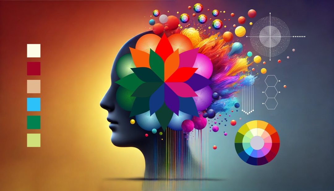
Color psychology delves into the profound impact that different hues have on human emotions, behaviors, and decision-making. Whether it’s the vibrant red of a fast-food logo that stimulates appetite or the calming blue of a bedroom wall that promotes relaxation, colors communicate on a subconscious level, shaping our perceptions in ways we may not even realize. Businesses, designers, and marketers leverage this knowledge to craft compelling brand identities, enhance user experiences, and influence consumer choices. That’s why top design and marketing experts frequently emphasize the significance of color psychology; it’s not just about aesthetics but about strategically shaping perceptions and interactions.
Why color matters
Categories of colors in the color wheel
Emotional triggers
- Colors can evoke strong emotional responses, such as excitement, calmness, or trust.
- Marketers and designers leverage these reactions to guide how consumers feel about a product or brand.
Cultural significance
- Color meanings can vary across cultures.
- Understanding these cultural nuances is crucial for global brands to avoid misinterpretation.
Brand identity & recognition
- A signature color can increase brand recognition by up to 80%, according to multiple marketing studies.
- Think about how Tiffany & Co.’s signature blue box is instantly recognizable worldwide.

Basic color psychology
Below is a rundown of some common colors and the feelings or ideas they often convey. Keep in mind that individual and cultural differences play a significant role:
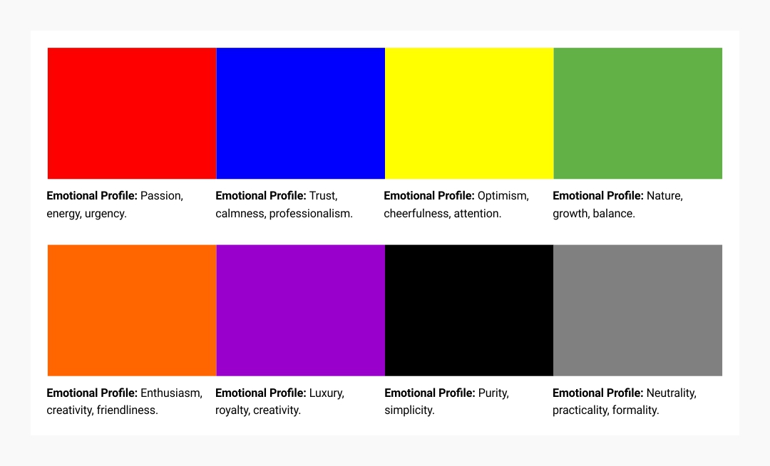
Red
- Emotional Profile: Passion, energy, urgency.
- Common Uses: Sales promotions (to create urgency), food industry (to stimulate appetite), warning signs (to signal danger).
- Examples:Coca-Cola’s red packaging is instantly recognizable and evokes excitement and boldness.
Blue
- Emotional Profile: Trust, calmness, professionalism.
- Common Uses: Corporate logos, healthcare services, financial institutions.
- Examples: Facebook’s logo fosters a sense of reliability and community.
Yellow
- Emotional Profile: Optimism, cheerfulness, attention.
- Common Uses: Child-focused products, warning signs (caution), brand elements that need to stand out.
- Examples: McDonald’s golden arches bring a sense of warmth and familiarity.
Green
- Emotional Profile: Nature, growth, balance.
- Common Uses: Eco-friendly products, health and wellness, finance (often linked to money in some cultures).
- Examples: Whole Foods and Starbucks highlight freshness and a connection to nature.
Orange
- Emotional Profile: Enthusiasm, creativity, friendliness.
- Common Uses: Youth-oriented products, adventure or sports brands, call-to-action buttons.
- Examples: Nickelodeon uses orange to reflect energy and fun.
Purple
- Emotional Profile: Luxury, royalty, creativity.
- Common Uses: Cosmetics, high-end products, spiritual or imaginative themes.
- Examples: Cadbury’s purple wrapper conveys indulgence and richness.
Black & White
- Emotional Profile: Sophistication (black), purity (white), simplicity.
- Common Uses: Luxury branding, minimalist design, formal or elegant occasions.
- Examples: Chanel’s iconic black-and-white palette exudes timeless elegance.
Gray
- Emotional Profile: Neutrality, practicality, formality.
- Common Uses: Tech products, professional services, background or accent color.
- Examples: Apple’s sleek gray product finishes signal modernity and simplicity.

The science behind color perception
Biological factors
- Human eyes have three types of cone cells sensitive to red, green, and blue light, forming the basis of trichromatic vision.
- Variations in color perception can exist (e.g., color blindness), impacting how a brand’s color palette is viewed.
Psychological associations
- According to color theory studies, our brains form instant judgments based on color, influencing decisions like clicking on a button or buying a product.
- Emotional states can be amplified by color (e.g., warm colors can elevate feelings of excitement).
Cultural context
- logs such as 99designs emphasize how color meanings shift globally. White might represent purity in Western cultures but is associated with mourning in some Eastern cultures.
Applying color psychology in branding & marketing
Brand personality
- Determine whether your brand is playful, sophisticated, or eco-friendly, then align your color palette accordingly.
- Example: A children’s toy brand might use bright, primary colors to spark energy and excitement.
Audience research
- Consider your target demographic’s cultural background, age, and personal preferences.
- Example: If your audience values sustainability, using green or earth-toned branding can resonate more strongly.
Consistency across platforms
- Maintain color consistency across websites, packaging, social media, and advertising.
- Example: Adobe’s Creative Cloud apps each have a distinctive color icon but share a unified style.
Call-to-action (CTA) design
- Contrasting colors for CTA buttons can increase click-through rates.
- Example: HubSpot often suggests using a complementary color for CTA buttons to grab users’ attention.
Common pitfalls in color usage
Overwhelming palettes
- Using too many bright colors can confuse your audience and dilute your message.
- Limit your palette to a few key colors for coherence.
Ignoring accessibility
- Many top blogs highlight color contrast for readability.
- Ensure text is legible against backgrounds for all users, including those with visual impairments.
Cultural missteps
- Research color symbolism in different regions to avoid inadvertently sending the wrong message.
- Example: Red can signify good fortune in some cultures but can represent danger in others.
Evolving trends in color psychology
Pastel palettes & soft gradients
- Modern UI and web design often incorporate gentle gradients and pastel hues for a calm, approachable feel.
- Popular in lifestyle, wellness, and tech brands aiming for a friendly vibe.
Bold minimalism
- Bright, single-color backgrounds with clean typography emphasize a strong brand statement.
- Often used in fashion or creative agency websites to stand out.
Dark mode aesthetics
- Many apps and operating systems now offer dark mode, requiring designers to rethink color choices and contrast for nighttime readability.
Measuring the impact of color choices
A/B testing
- Experiment with different color schemes for websites or ads to see which yields better engagement.
- Tools like Google Optimize or heatmap analytics can help measure effectiveness.
User feedback & surveys
- Ask users directly about their preferences and experiences with your brand’s color palette.
- This qualitative data can guide color refinements.
Conversion rates & brand recall
- Track how color changes influence sales, sign-ups, or brand recognition.
- If brand recall improves after introducing a new signature color, it’s likely the right choice.
Final Thoughts
Color psychology isn’t a one-size-fits-all formula, but it offers powerful guidelines for shaping consumer perceptions and emotions. By understanding basic color meanings, cultural contexts, and the science behind color perception, you can intentionally craft visuals that resonate with your audience.
Whether you’re a small business owner choosing a logo color or a seasoned designer refining a user interface, color decisions can make a profound impact on how people experience and remember your brand. Take cues from top design and marketing blogs—test, refine, and adapt. When color is used with purpose, it transforms ordinary visuals into unforgettable experiences.