Color theory is a fundamental framework used by artists, designers, and marketers to craft visually appealing and meaningful color compositions. It explores the relationships between colors, how they interact when combined, and the emotional and psychological responses they evoke. This theory encompasses concepts such as the color wheel, complementary and analogous color schemes, warm and cool tones, and the impact of contrast and harmony. By understanding how colors influence perception and mood, professionals can effectively use them to create engaging designs, strengthen brand identity, and enhance user experiences. Whether in art, branding, fashion, or interior design, color theory serves as a powerful tool for storytelling and communication.
The color wheel
The color wheel is a fundamental tool in color theory that visually organizes colors in a circular format. It helps understand relationships between different colors and how they can be combined effectively.
Categories of colors in the color wheel
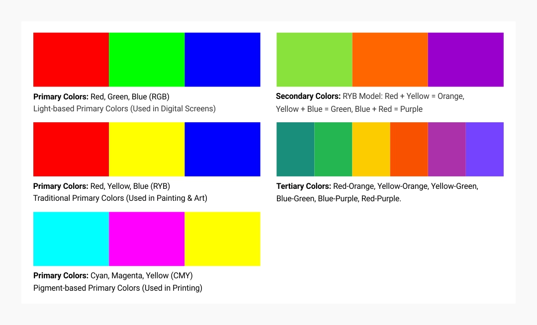
Primary Colors: These are the three base colors that cannot be created by mixing other colors.
- Red, Yellow, Blue (RYB) – Traditional Primary Colors (Used in Painting & Art)
- Red, Green, Blue (RGB) – Light-based Primary Colors (Used in Digital Screens)
- Cyan, Magenta, Yellow (CMY) – Pigment-based Primary Colors (Used in Printing)
Secondary Colors: Created by mixing two primary colors.
- RYB Model: Red + Yellow = Orange, Yellow + Blue = Green, Blue + Red = Purple
Tertiary Colors: Created by mixing a primary color with a neighboring secondary color.
- Examples: Red-Orange, Yellow-Orange, Yellow-Green, Blue-Green, Blue-Purple, Red-Purple.
Properties of colors
Each color has three main attributes that define its appearance:
Hue
- The pure form of a color, without any added black or white.
- Example: Red, Blue, and Green are hues.
Saturation (Chroma)
- Defines the intensity or purity of a color.
- High saturation: Vivid and rich colors.
- Low saturation: Muted or faded colors.
Value (Brightness/Luminance)
- Determines the lightness or darkness of a color.
- Tints (adding white) → Lightens the color.
- Shades (adding black) → Darkens the color.
- Tones (adding gray) → Lowers intensity while maintaining balance.
Color harmony and schemes
Color harmony refers to aesthetically pleasing color combinations that create balance in design. The most common color schemes include:
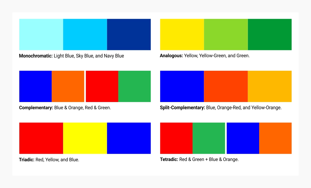
Monochromatic
- Uses different shades, tints, and tones of a single color.
- Example: Light Blue, Sky Blue, and Navy Blue in a single design.
- Effect: Elegant, minimalistic, and professional.
- Used in: Corporate branding, UX/UI design, and minimalist artwork.
Analogous
- Uses three adjacent colors on the color wheel.
- Example: Yellow, Yellow-Green, and Green.
- Effect: Creates a natural, serene, and comfortable look.
- Used in: Nature-inspired designs, soft backgrounds, and fashion.
Complementary
- Uses two colors directly opposite on the color wheel.
- Example: Blue & Orange, Red & Green.
- Effect: High contrast, bold, and energetic.
- Used in: Sports logos, call-to-action buttons in UX/UI, and advertising.
Split-Complementary
- Uses a base color and two colors adjacent to its complement.
- Example: Blue, Orange-Red, and Yellow-Orange.
- Effect: Balances contrast while avoiding harsh clashes.
- Used in: Modern graphic design, fashion, and branding.
Triadic
- Uses three colors equally spaced around the color wheel.
- Example: Red, Yellow, and Blue.
- Effect: Vibrant, lively, and playful.
- Used in: Children’s products, entertainment, and gaming UI.
Tetradic (Double Complementary)
- Uses two complementary color pairs forming a rectangle on the color wheel.
- Example: Red & Green + Blue & Orange.
- Effect: Rich and diverse, but must be balanced carefully to avoid visual overload.
- Used in: Posters, infographics, and experimental designs.

Color temperature
Colors are classified as warm or cool, which impacts their emotional and psychological effects.
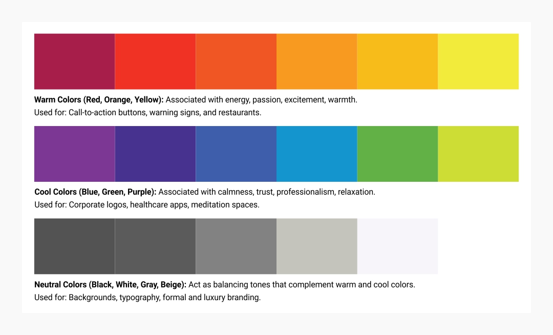
Warm Colors (Red, Orange, Yellow)
- Associated with: Energy, passion, excitement, warmth.
- Used for: Call-to-action buttons, warning signs, and restaurants.
Cool Colors (Blue, Green, Purple)
- Associated with: Calmness, trust, professionalism, relaxation.
- Used for: Corporate logos, healthcare apps, meditation spaces.
Neutral Colors (Black, White, Gray, Beige)
- Act as balancing tones that complement warm and cool colors.
- Used for: Backgrounds, typography, formal and luxury branding.
Additive vs. Subtractive color mixing
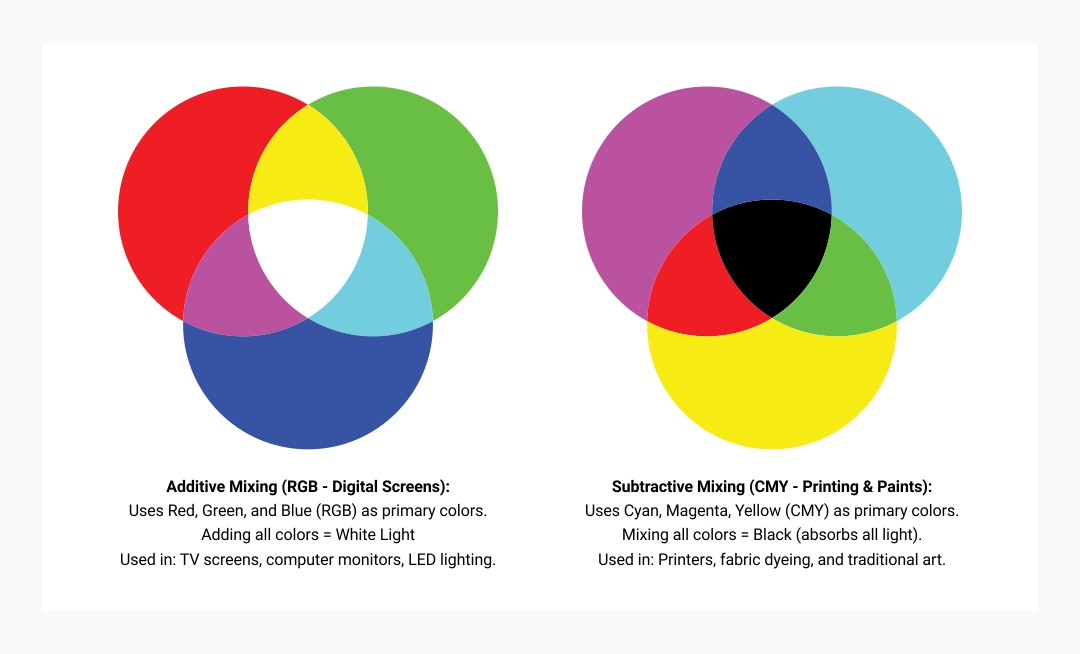
Color mixing works differently in digital (light) and physical (pigment/paint) mediums.
Additive Mixing (RGB - Digital Screens)
- Uses Red, Green, and Blue (RGB) as primary colors.
- Adding all colors = White Light
- Used in: TV screens, computer monitors, LED lighting.
Subtractive Mixing (CMY - Printing & Paints)
- Uses Cyan, Magenta, Yellow (CMY) as primary colors.
- Mixing all colors = Black (absorbs all light).
- Used in: Printers, fabric dyeing, and traditional art.
Color Psychology: Meaning of Colors
Colors evoke emotions and influence decision-making. Here’s how they are perceived:
Meaning: Energy, Passion, Urgency
Examples of use: Energy, Passion, Urgency
Meaning: Trust, Calmness, Professionalism
Examples of use: Facebook, LinkedIn, Medical Apps
Meaning: Nature, Growth, Health
Examples of use: Starbucks, Whole Foods, Eco-friendly Brands
Meaning: Happiness, Optimism, Attention
Examples of use: McDonald's, Snapchat, Warning Signs
Meaning: Enthusiasm, Creativity, Friendliness
Examples of use: Fanta, Nickelodeon, Amazon
Meaning: Luxury, Royalty, Imagination
Examples of use: Cadbury, Twitch, Beauty Brands
Meaning: Sophistication, Mystery, Power
Examples of use: Nike, Chanel, High-end Fashion
Meaning: Purity, Minimalism, Cleanliness
Apple, Tesla, Medical Branding
Practical applications of color theory
Branding & Marketing
- Companies use colors strategically to create brand identity and influence customer perception.
- Example: Red (Coca-Cola) stimulates excitement; Blue (Facebook) builds trust.
UI/UX Design
- Color influences user experience, readability, and interaction.
- Example: Call-to-action buttons often use red or orange to draw attention.
Fashion & Interior design
- Designers use color palettes to create moods and styles.
- Example: Cool colors for relaxing bedrooms, warm tones for lively cafes.
Film & Photography
- Color grading sets the mood and tone of visuals.
- Example: Horror movies use dark, desaturated colors; Comedies use bright, vibrant colors.
Final Thoughts
Mastering color theory allows designers, artists, and marketers to create impactful visuals that communicate messages effectively. Understanding color relationships, psychology, and harmonies helps craft designs that resonate with audiences and evoke desired emotions.